How should AI fit into the moment someone is editing their shop? Merchants already have the text or image in front of them. Leaving the editor means copying content out, explaining the change in another tool, and bringing the result back. I designed a concept that keeps that work together: select content, ask for a change, review the result, and decide whether to use it.
I explored the first ideas in Figma, then moved into the product codebase and built the whole flow as a working prototype. I used Codex as my coding assistant and tried many versions of the interactions and states directly in the editor.
Project Type
AI editor concept
Tools
Figma, Codex, code prototyping, user testing
My Role
UX/UI design and prototype development
Focus
Selection, preview, and control over text and image edits
Starting with the content
The selected content became the starting point for the interaction. In the wine-shop example, the merchant highlights a paragraph and opens the assistant directly beside it. The surrounding page stays visible, so they can judge the suggestion alongside the images, layout, and original copy.
This also shaped the preview. The suggestion appears below the selection, and the original stays in place until the merchant chooses Replace. Opening the assistant or generating a result should not itself change the page.
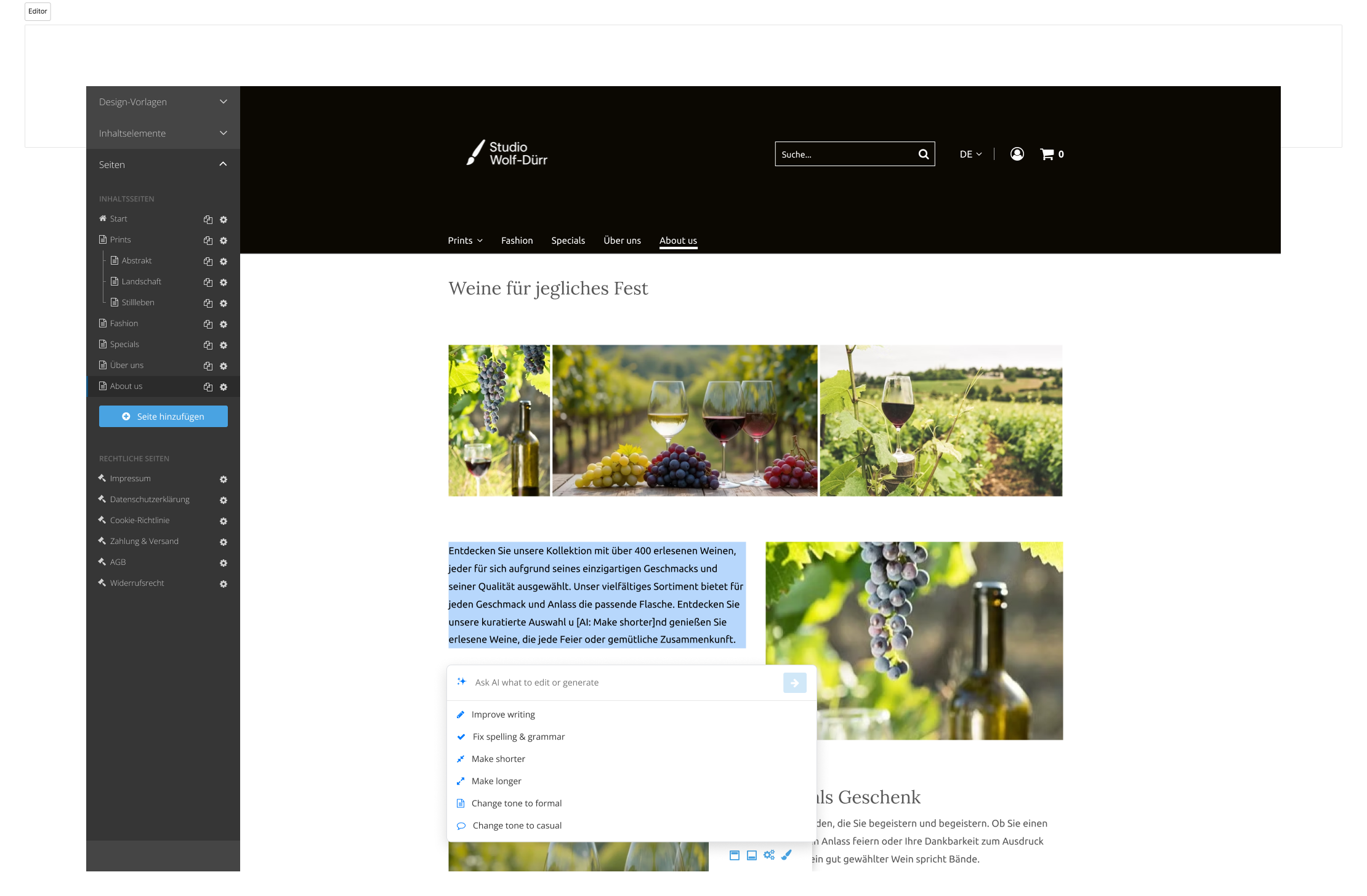
The assistant opens beside the selected wine-shop copy. 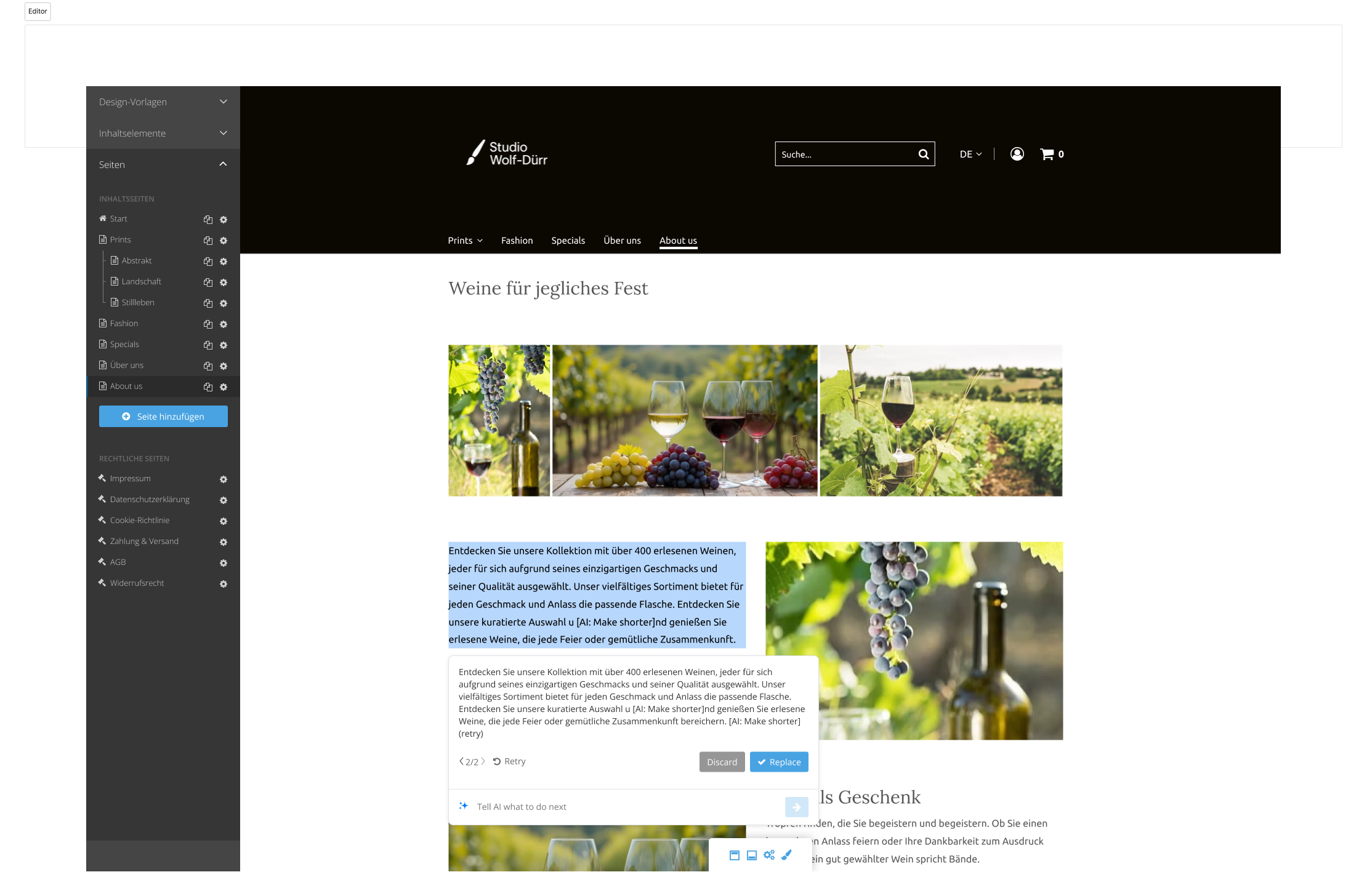
Original and suggested copy remain visible together until Replace.
Making the next step clear
A prompt field gives merchants flexibility, but common edits should be easy to start. I put suggested actions beside it: improve writing, fix spelling and grammar, make text shorter or longer, and change the tone to formal or casual. Merchants can choose an action or describe a change in their own words.
After that choice, the interface needs to explain the wait. The prototype distinguishes analysing text from writing it, shows the text as it appears, and keeps Cancel available. These states make progress visible while keeping the result separate from the page.
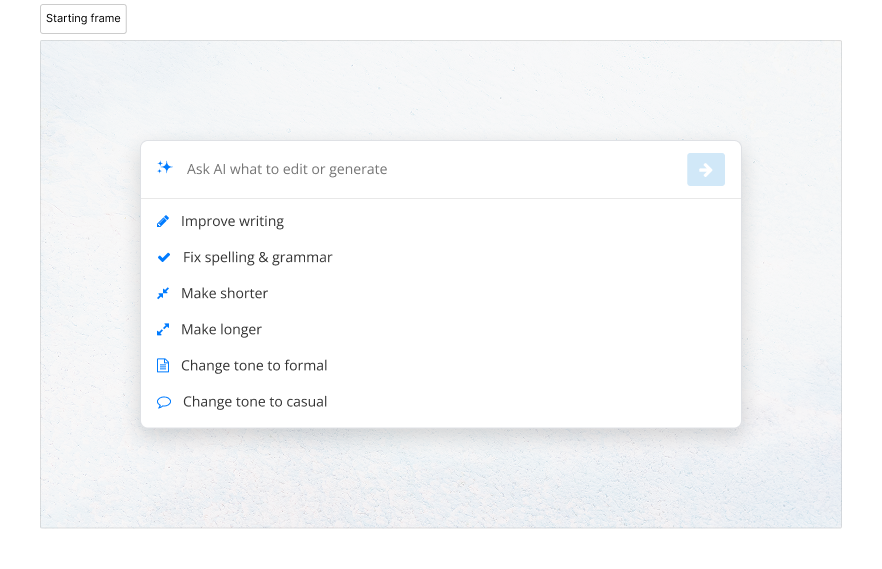
Suggested actions give common edits a clear starting point. 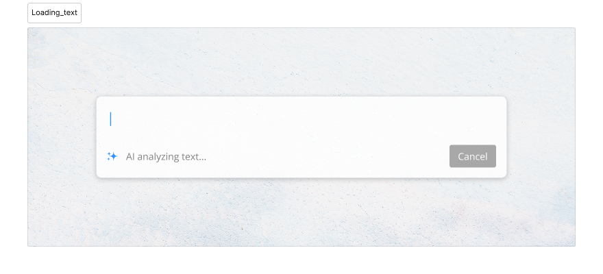
A status message explains the wait; Cancel keeps an exit available. 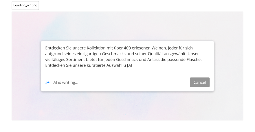
Text appears in the preview while the original stays unchanged.
Leaving room to try again
A generated suggestion may still need work. The next decision is whether to try another version, refine this one, or use it. I kept those choices together: Retry generates another attempt, version navigation returns to earlier results, and a follow-up prompt continues from the current suggestion.
The examples show both suggested actions and a written follow-up, “Make funnier”. This lets the merchant move from a general edit to a more specific request within the same flow. Discard and Replace remain separate decisions: exploring a result does not commit it.
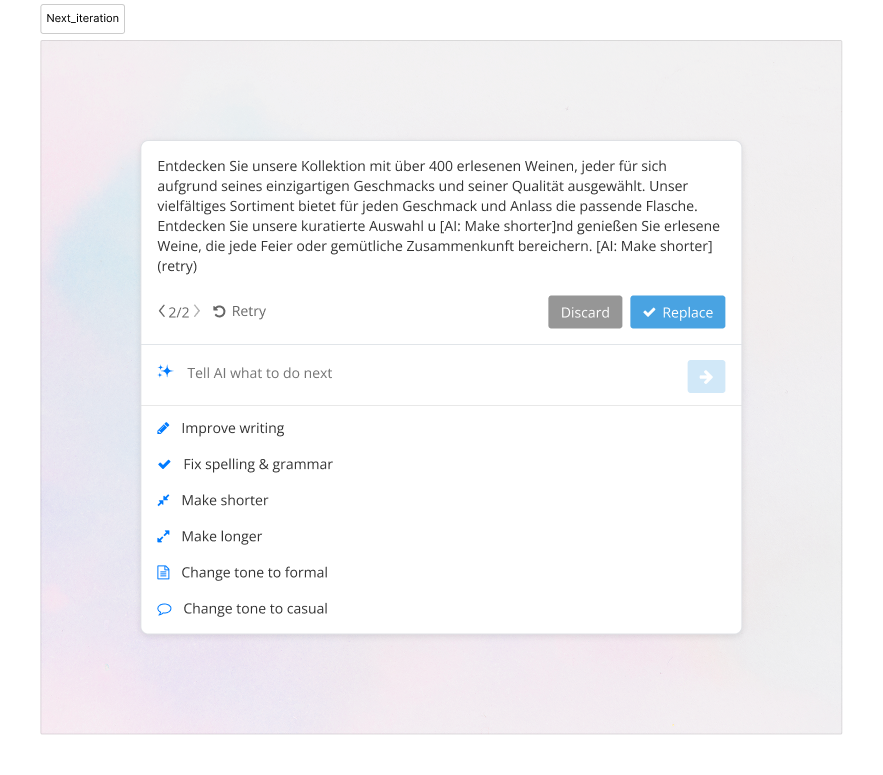
Version navigation, Retry, and Replace separate trying from committing. 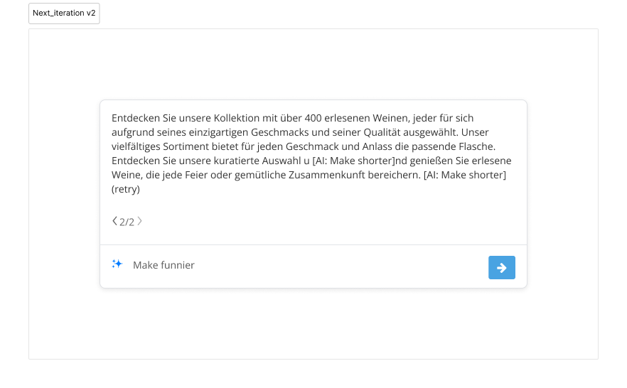
A follow-up such as “Make funnier” builds on the current result.
Carrying the pattern into images
Text and image edits ask the merchant to make a similar decision: is this result worth using? I carried the same sequence into image editing: ask for a change, wait for a preview, compare the result, and apply it when ready.
The preview changes with the content. Text can appear as it is written; the image flow reserves space while the preview is being finalised. The cat and portrait examples keep the original image above the suggestion. Retry, version navigation where available, and follow-up prompts support further attempts. Apply is the explicit step that accepts the image change.
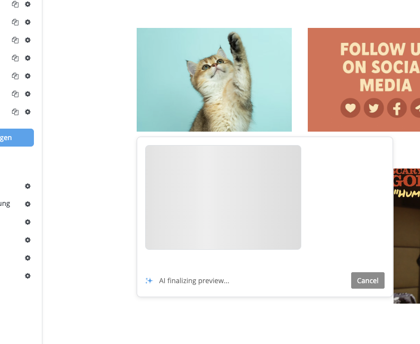
The image preview has its own loading state and Cancel action. 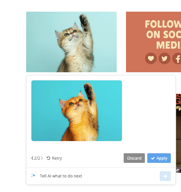
The cat example keeps the original above the generated variant. 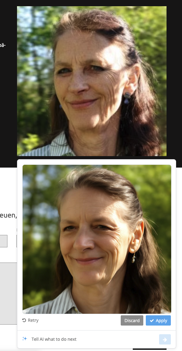
The portrait example uses the same preview and Apply pattern.
What changed after testing
After testing, I made version navigation clearer and added a follow-up prompt for refinement without restarting. These changes address two parts of iteration: knowing which result is on screen and deciding what to ask for next. I also kept every edit non-destructive until Replace or Apply.
The principle running through the concept is simple: keep the original visible, make it easy to try another direction, and give the merchant a clear moment to accept the change. That shaped the assistant from its first suggested action to its final button.