Riders' App Redesign
How I rebuilt the Cyclopath rider app so couriers could complete shifts with less friction.
Overview
Cyclopath, an application for riders of a food delivery startup, was originally a web app plagued by performance issues, leading to inefficiencies in delivery operations. Recognizing the need for an overhaul, I embarked on redesigning Cyclopath to offer a better user experience and faster handling, focusing on minimal user input and tight integration of essential functions.
Key Features of Cyclopath Redesign
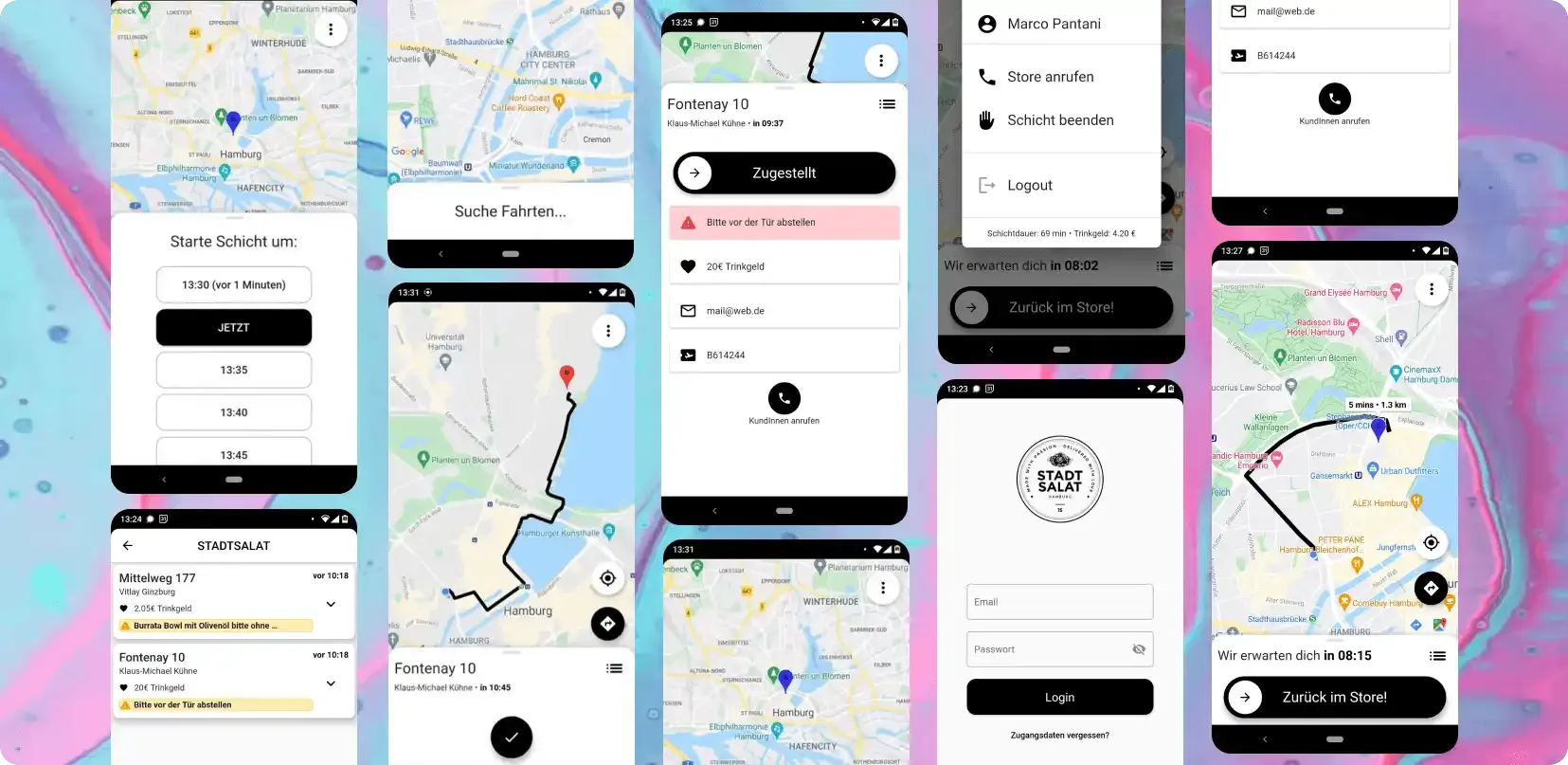
Simple Shift Selection
The redesign simplifies the shift start process with a straightforward time slot overview, enabling riders to easily select their working hours.
Automated Route Display and Order Management
Upon receiving orders, the route is automatically displayed. Riders can mark an order as delivered with a simple drag of a button, immediately showing the route for the next delivery.
Automated Return Route to Hub
Once all deliveries are completed, the app automatically displays the route back to the hub, streamlining the end-of-shift process for riders.
Opportunity
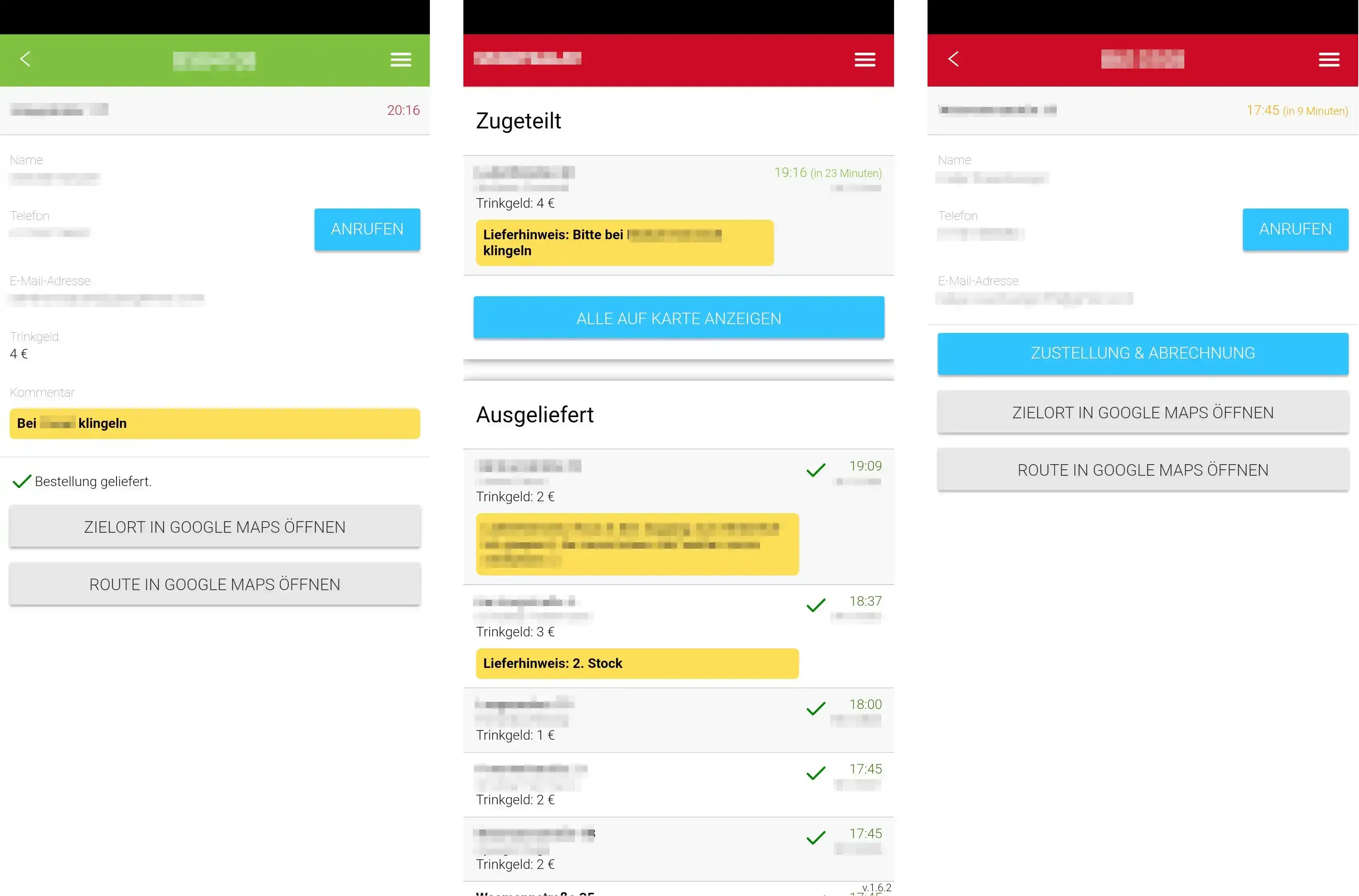
The existing web app was slow, often required restarts, and had a cumbersome process for accessing directions, usually necessitating manual input into Google Maps. The goal was to create an app tailored for riders, streamlining everything from login to order delivery and return to the hub, all with minimal user input.
Research and Analysis
Competitive Analysis
I reviewed existing courier apps to find where shift start, routing, and handoff flows break under real delivery pressure.
User Surveys and Interviews
Short rider interviews and survey feedback showed recurring pain points: slow loading, too many taps, and manual map handoffs.
Design Process
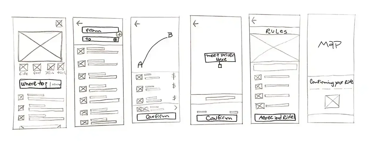
Ideation and Sketching
Rapid sketching sessions helped ideate on the user interface, focusing on simplicity and ease of navigation.
Wireframes and Prototyping
Low-fidelity wireframes were created to outline basic app functionality. These evolved into clickable prototypes for user testing.
High-Fidelity Prototype
Developing a high-fidelity prototype meant refining visuals and interactions while keeping alignment with the overall design goals.
Usability Testing
Testers interacted with the prototype, providing feedback on usability and intuitiveness. The findings were important for the final design iteration.
Key Features and Improvements
- Integrated Google Maps: Direct integration for route planning and navigation, eliminating manual address input.
- Streamlined Order Management:Simplified interface for receiving and managing orders, with minimal user input.
- Efficient Route Optimization:Automated route optimization for deliveries, giving the fastest possible delivery times.
- User-Centered Design: A clear, intuitive interface focusing on the courier's ease of use during their entire shift.
- Reliable Performance: Enhanced app stability and speed, reducing the need for restarts and improving overall efficiency.
- Feedback Mechanism: Easy-to-use feedback options for continual improvement based on courier experiences.
Lessons Learned
- User-Centric Design is Key:Focusing on courier needs and real constraints is in developing a functional and successful app.
- Simplicity Enhances Efficiency:Minimizing user input can significantly improve operational efficiency in a fast-paced environment.
- Continuous Feedback is Vital:Regular user feedback helps in refining the app and addressing issues promptly.
Conclusion
The rebuilt app removed restart-heavy flows, reduced manual route work, and made shift execution more predictable for riders. The project reinforced a simple lesson: in delivery contexts, fewer decisions and fewer taps win.