Taking the Pulse
How we designed a daily check-in app people would actually use.
Overview
Perceptive Pulse is a mobile app designed to enhance employee well-being by allowing users to reflect on and track their personal experiences. By gathering feedback on key aspects like stress, team collaboration, and workplace environment, it helps individuals and teams improve satisfaction, health, and communication.
Highlights
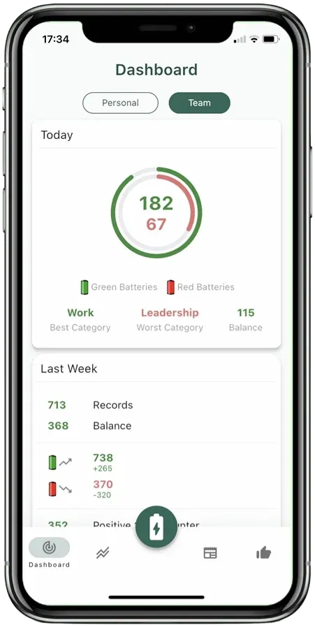
Keep an Overview
All key facts and figures are shown in compact daily, weekly, and monthly summaries.
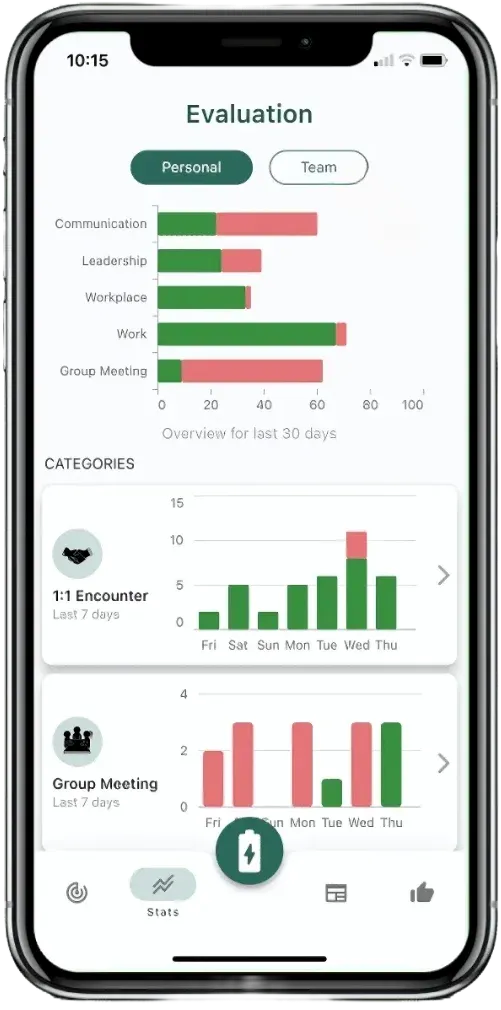
Analyze
The recorded red and green batteries can be evaluated in a variety of ways—both individually and for teams or organizations.
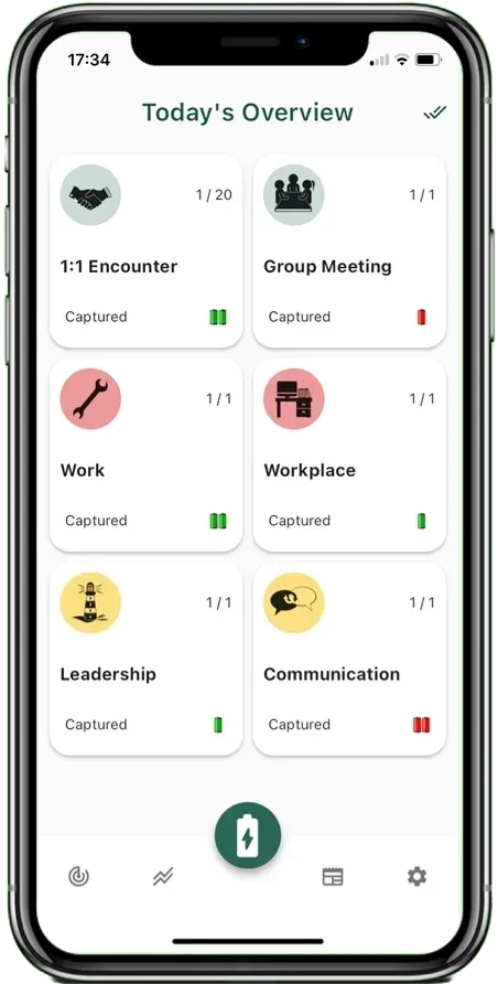
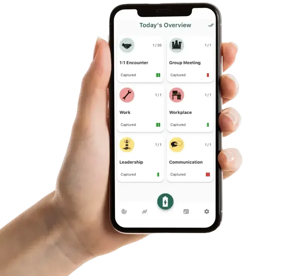
Select a Category
The overview of active categories is the starting point for daily entries.
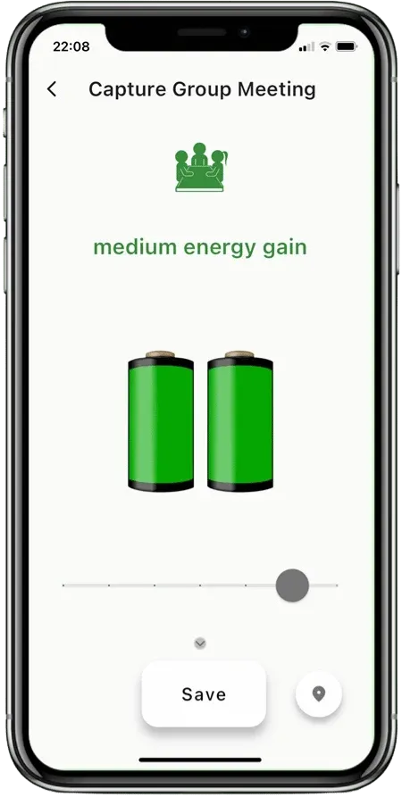
Submit Ratings
Categories can be rated daily with red or green batteries.
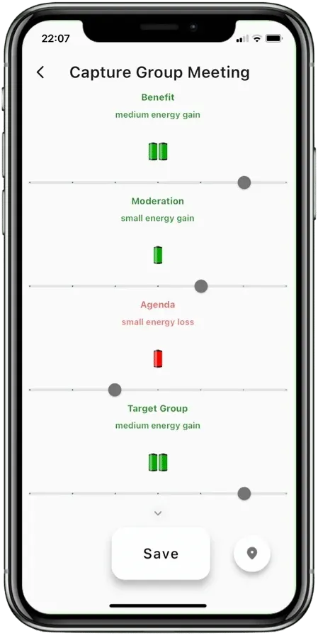
Reflect on Details
Optional details can be recorded for additional transparency in each category.
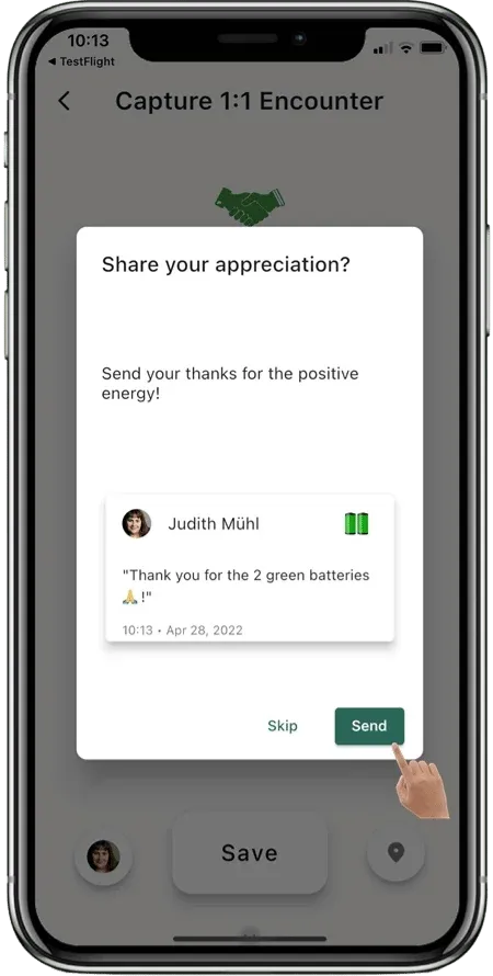
Show Appreciation
A small "thank you" for helpful, friendly, and inspiring interactions.
Problem Exploration
Perceptive Pulse turns daily check-ins into readable trends for employees and teams, so decisions are based on patterns instead of gut feeling.
"Interviews showed two clear needs: employees wanted a quick, low-effort check-in, and managers wanted anonymized trends they could discuss and act on."
Research and Analysis
We ran interviews, surveys, and A/B tests with employees, team leads, and HR. The goal: track well-being and collaboration with minimal daily effort.
- Quick Inputs: 80% of users preferred the red and green battery system, spending under 1 minute daily.
- Useful Team Signals: Team leads preferred anonymized trends and week-over-week changes they could discuss in retros.
- Privacy First: When privacy rules were explicit and easy to find, adoption stayed higher.
Design Process
We started with research to understand employee and team lead needs. Feedback pushed us toward simplicity: a clean UI and the red/green battery input. Prototyping and usability tests helped refine analytics, privacy settings, and navigation.
Key Features
- Daily Reflection:Using red and green batteries, users quickly input their emotional response to categories like "Meetings," "Work Environment," and "Workload."
- Category Customization:For tailored workplace assessment, categories can be set according to team needs and business types, supporting precise tracking.
- Feedback & Trends:Graphs and reports help employees and managers spot changes early.
- Privacy:Clear privacy rules and safe defaults so people trust the data.
Outcome
The final flow made daily check-ins fast, kept privacy understandable, and gave teams trend views they could actually use in day-to-day work.