The actual experiment
The goal was not to polish one nice image. The goal was to learn how a browser can use the GPU to reinterpret any image as a live graphic system. A face happened to be a useful test case because it is unforgiving: if the tile size, crop, contrast, or pattern mapping is wrong, readability breaks immediately.
That constraint made the research practical. I needed to understand image sampling, UV coordinates, fragment shaders, texture atlases, render targets, and pointer-driven uniforms well enough to control the result instead of guessing.
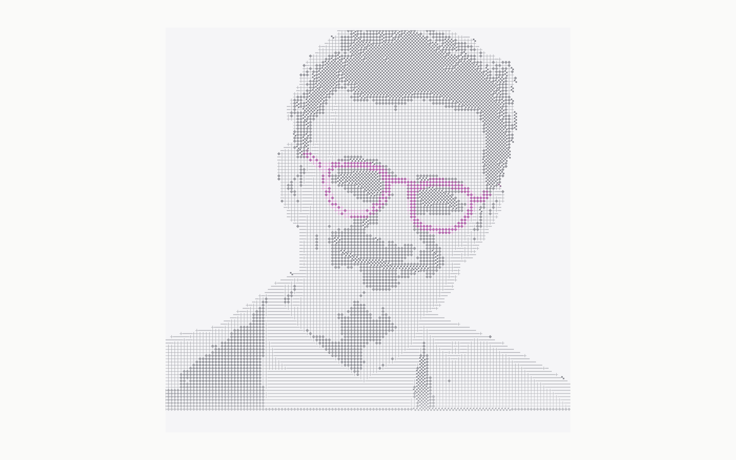
From portrait to graphic marks
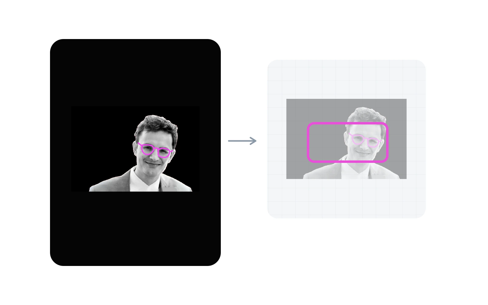
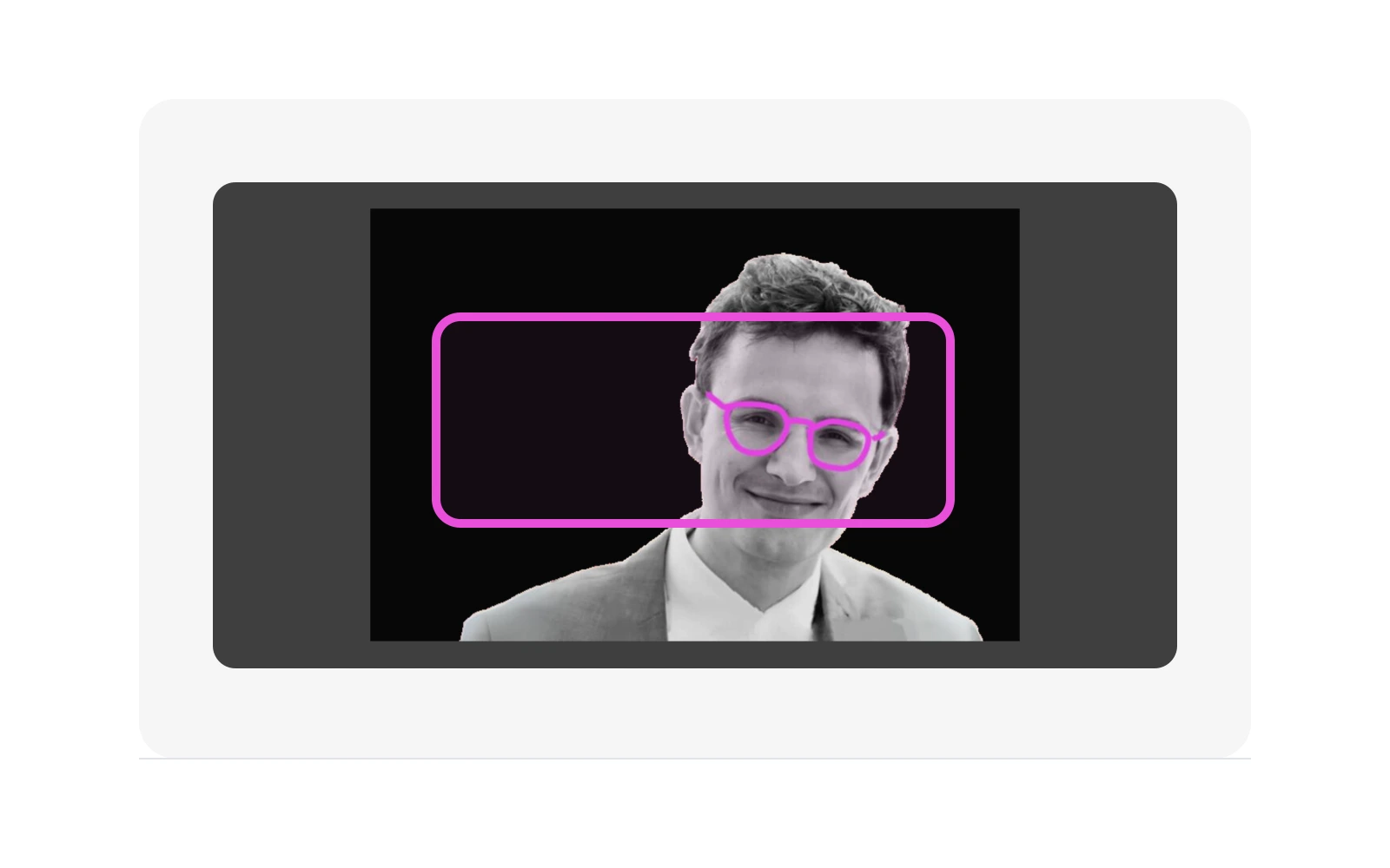
The process is simpler than it looks. Start with a photo. Put it into a stable frame. Cut that frame into small squares. Check how bright each square is. Then replace that square with a matching graphic mark.
That made the effect easier to reason about. If the crop was wrong, the face disappeared. If the squares were too large, it became blocky. If the marks were too loud, the image stopped feeling like a portrait.
Why WebGL instead of HTML or Canvas 2D
The obvious version would be HTML, SVG, or Canvas 2D. Draw a grid, place small marks, update them on hover. That works for a static sketch, but it quickly becomes a bookkeeping problem.
I wanted the whole image to behave like one live surface. WebGL fits that better. The browser sends the source image, the pattern atlas, and the hover texture to the GPU. Then the shader repeats one small decision across the image: how bright is this area, and which mark should it become?
That is the reason for WebGL here. Not because it is more impressive, but because it keeps the experiment about the image and the interaction instead of managing hundreds of separate elements by hand.
The architecture I ended up with
The site stays Astro because most pages are content. The shader renderer is mounted as a React island only where a live canvas is needed. React Three Fiber owns the canvas lifecycle, Three.js owns GPU resources, and GLSL owns the visual rules.
The important decision was to make the WebGL scene configurable instead of one-off. The same scene accepts an image URL, atlas configuration, tile size, crop anchor, color mode, fluid settings, and interaction settings. That makes the homepage hero, the article hero, and the experiment card different configurations of the same renderer.
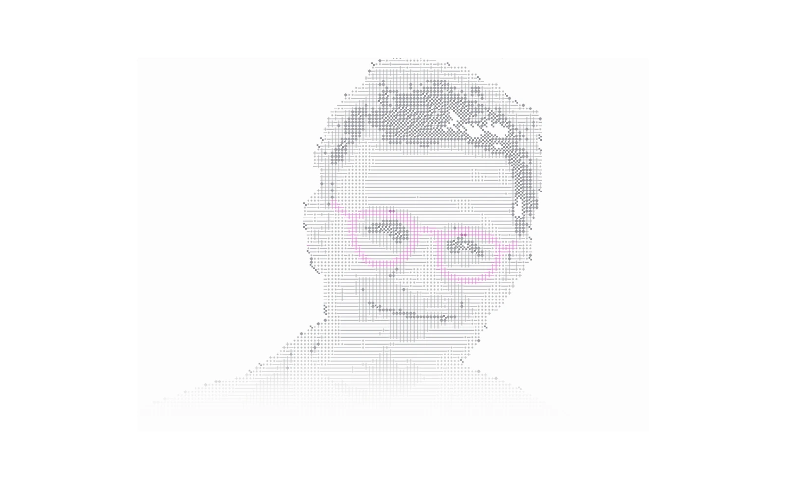
Image to ASCII: the shader pass
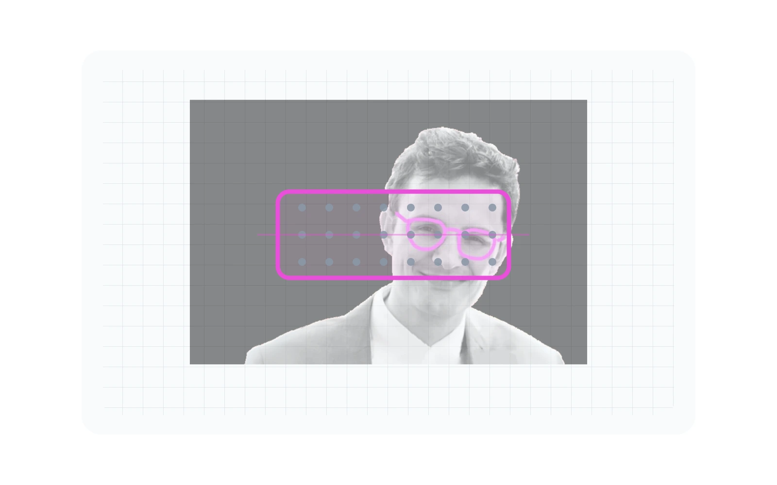
The fragment shader starts with UV coordinates and a cover-style image fit.
That keeps the source image framed like CSS object-fit: cover,
but inside shader space. Each fragment is snapped into a tile grid with
floor(pixel / tileSize), and the shader samples the source
image once at the center of that tile.
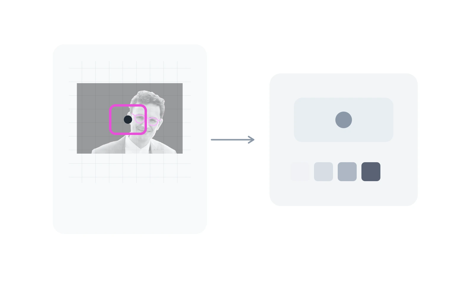
The sampled color is adjusted through exposure, brightness, contrast, and saturation. Then luminance is calculated. That luminance becomes a pattern index: bright regions choose lighter atlas columns, dark regions choose denser atlas columns. The final image is not a filtered photograph. It is a remapping from image brightness to a graphic vocabulary.


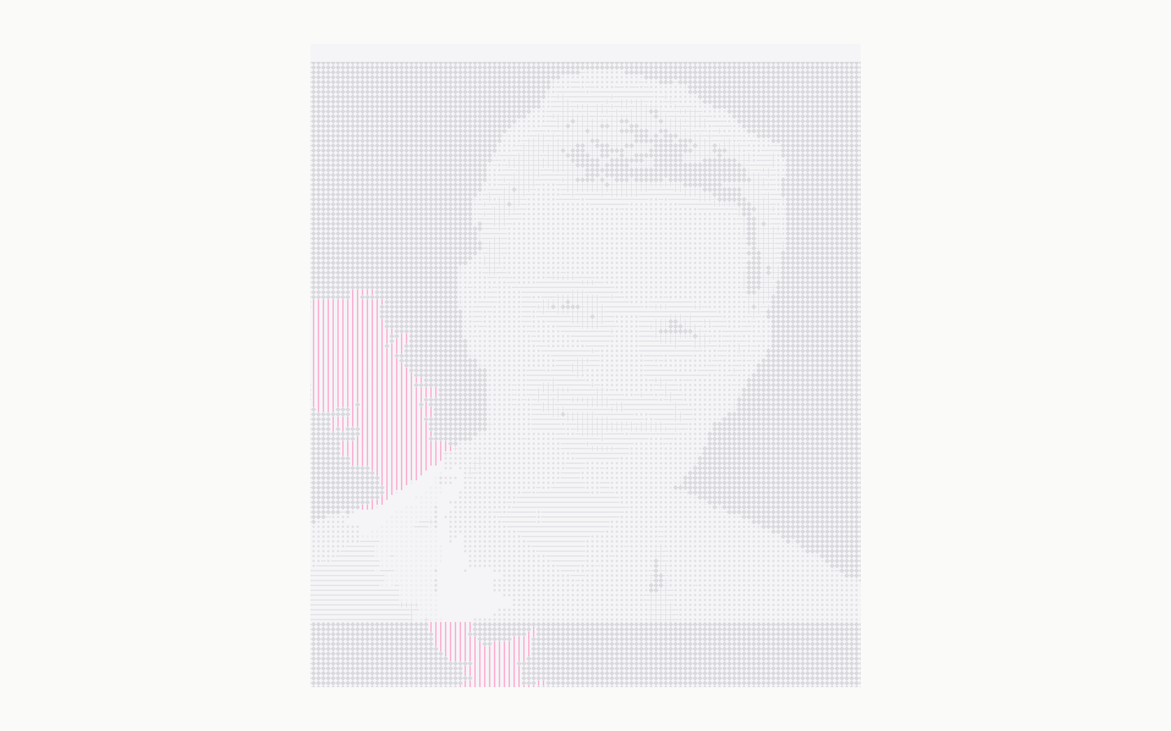
Why there is a fluid simulation
The fluid part is not there to make the image look like liquid. It creates a continuous texture that the final shader can read. Pointer movement adds splats into offscreen framebuffers. The simulation advects velocity and density, calculates divergence, solves pressure, subtracts the pressure gradient, and writes the next density texture.
The ASCII shader samples that density texture as a reveal mask. Where the mask is strong, the shader blends toward the alternate atlas and allows more source color to appear. In the current implementation the fluid output is mainly a control texture, not a true UV warp. That distinction matters: the grid stays stable while the reveal feels organic.
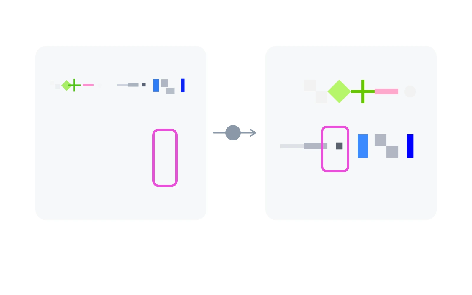
Data flow
What I iterated on
Most iterations were not visual decoration. They were renderer parameters: tile size, atlas choice, crop anchor, luminance thresholds, saturation, bottom fade, splat radius, density dissipation, velocity dissipation, and the balance between stable structure and interactive reveal.
Small changes had large effects. A slightly smaller tile size made the image more readable but less graphic. A different atlas changed the whole tone. Higher density dissipation made interaction linger, but too much of it made the output muddy. The useful lesson was that shader work is often parameter design as much as code.
Homepage hero iterations
I also tested the renderer in the real homepage layout. That changed the judgment criteria: the image had to sit next to navigation, large type, links, and case-study cards without stealing the whole page.
These versions show the path from a generic placeholder to a more personal graphic language with enough structure, restraint, and one clear color anchor.

Live playground
I used a small live control panel to tune the renderer while building it: source image, atlas, color mode, tile size, crop, reveal strength, and fluid behavior all change the result immediately.
What I learned technically
I learned that a shader effect becomes useful when it is split into clear inputs and passes: source texture, atlas textures, uniforms, offscreen render targets, a simulation texture, and a final fullscreen pass. Once those pieces are separated, the output can evolve without rewriting the renderer.
The result is a small ASCII shader system: one reusable WebGL scene, one fluid control pass, one image-to-atlas shader, and several configurations that can become hero graphics, experiment previews, or technical studies.