Client
Municipality Governing Multiple Cities
Tools Used
Figma, Hotjar, Miro, Adobe Creative Suite, Flutter/Dart, VS Code
My Role
UX/UI Designer at yucon digital GmbH
Project Time
3 Months (May 2023 - July 2023)
For ~1.2M visitors per year, key tasks were fragmented: tourist tax, schedules, tickets, and activity info lived across multiple sites.
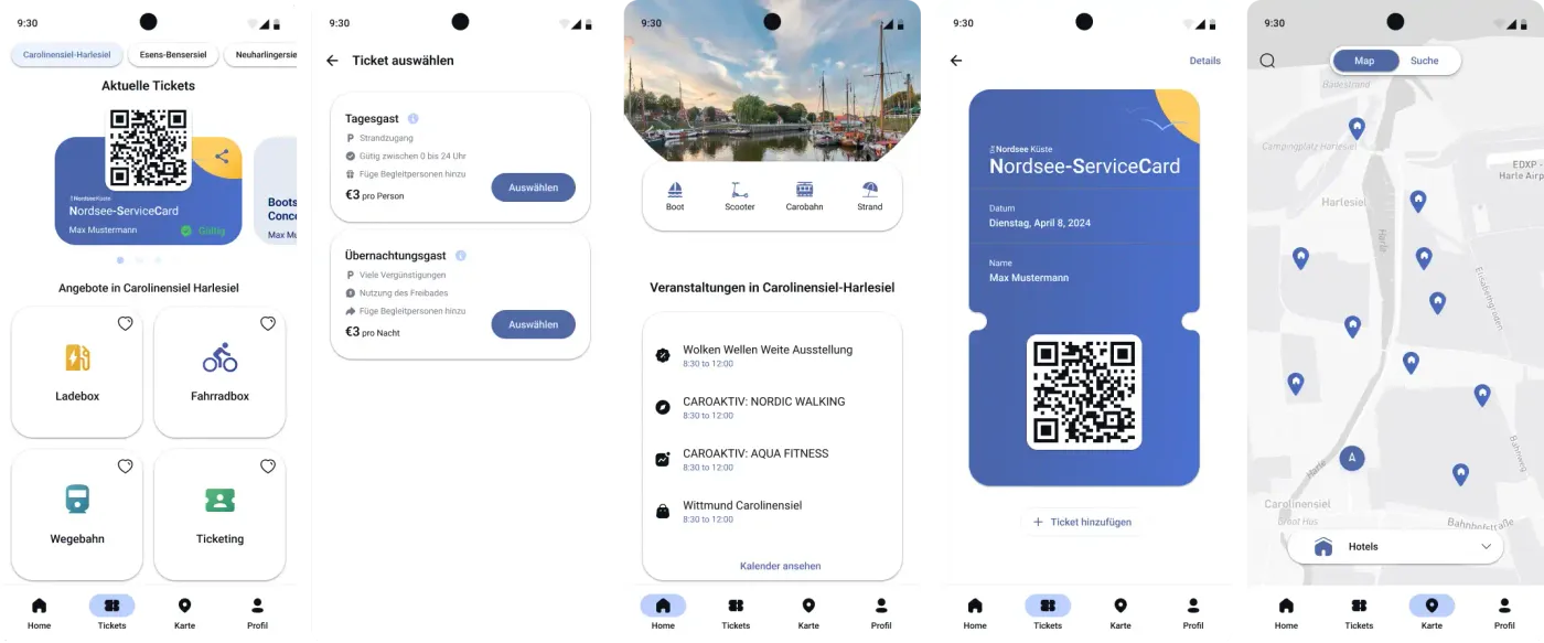
Beach Butler: Easy access to beach services and amenities 
Integrated public transportation information and ticketing 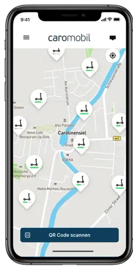
CaroMobil: All your mobility options in one place 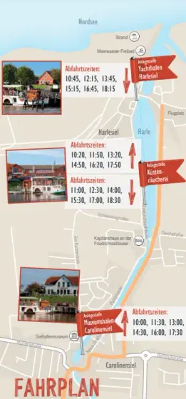
Discover local attractions and events with Concordia 
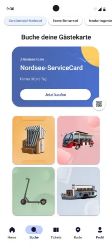
Streamlined tourist tax payment system
The fragmentation frustrated visitors and created extra work for the municipality. As a UX/UI Designer at yucon digital GmbH, I led a three-month design effort to bring these services into one mobile app.
The client, a municipal authority, aimed to launch this solution in one city as a pilot, with plans to offer it as a white-label product to others. My role spanned research, prototyping, and testing, with development beginning in parallel and currently in beta.
The Process: A Hypothesis-Driven Design Approach
We kicked off with stakeholder interviews to align on goals: improve tax compliance, reduce admin work, and make discovery/booking easier. I also spoke with local experts (guides, vendors, ferry operator) to understand the current info flow. A guide put it simply: "Visitors rely on us for event schedules because online info is scattered."
We mapped the visitor journey—arrival, tax payment, activity discovery, departure—capturing pain points and opportunities. This exercise, documented in a sprint map, set the foundation for our work.
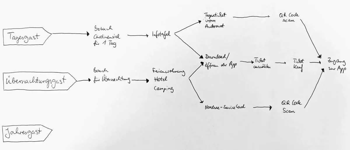
Sprint map showing actors on the left, their required steps in the middle, and goals on the right.
Research: Defining User Needs
To inform the design, I combined interviews, short on-site observations, and a survey. In interviews, a retiree couple told me they missed the paddle steamer because they couldn’t find the schedule. A parent put it bluntly: "I’ve got ten minutes to plan, not an hour." On site, I saw people give up on a glitchy website and ask vendors directly instead. The survey backed this up: people wanted one place for schedules, tickets, and basic info — fast and easy to understand.
Everything's spread out and confusing—I just want one place to figure it all out without the hassle.
The problem statement emerged that guided our hypotheses: Visitors need a single platform to pay taxes and explore offerings, as the current system wastes time and reduces satisfaction.
Ideation and Prototyping: Testing Assumptions
We tested two browsing patterns (swipe cards vs. grid) with visitors and iterated quickly. Below are the interface iterations and what we learned.
Exploration 1
Swipeable Offerings
- Hypothesis: A swipeable card interface will feel modern and engaging, encouraging users to explore offerings.
- Testing: Younger users liked it, but older users found it confusing.
- Insight: Swiping wasn't obvious to everyone. Simplified design needed.
Exploration 2
Simplified Swipe Cards
- Hypothesis: Cleaner cards with visual cues for swiping.
- Testing: Users liked the design but missed the swipe functionality.
- Insight: Visual cues weren't enough. Moving to simpler layout.
Exploration 3
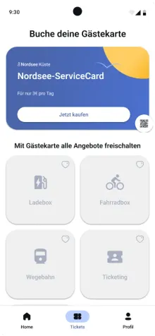
Grid Layout
- Hypothesis: Grid layout for immediate overview of offerings.
- Testing: 90% task completion rate. Users found it clear and easy to scan.
- Insight: Grid met user needs. Adding more details for better usability.
Exploration 4
Enhanced Grid with Ticket Details
- Hypothesis: Using greyscale icons to signify that a service card must be purchased first.
- Testing: 30% faster ticket purchases.
- Insight: Reduced friction confirmed. Ready for development.
Development and Iteration: Learning from Early Errors
We learned to test earlier. Swipe navigation failed for part of the audience, so we shifted quickly. In ticket purchase, dropoff at payment went from ~20% to about 5% after reducing clicks.
The UX Toolkit: How We Found Our Way
Throughout this journey, I relied on a strategic combination of research and testing methods that guided our decision-making:
Understanding the Landscape
- Stakeholder interviews with municipal managers revealed business goals and constraints
- Contextual inquiry with local experts showed how tourists struggled in real-time
Capturing User Needs
- User interviews with visitors uncovered frustrations with the fragmented experience
- Surveys quantified pain points across hundreds of responses
Synthesizing Insights
- Affinity mapping transformed scattered feedback into clear patterns and priorities
Validating Solutions
- Usability testing across all iterations revealed what worked and what didn't
- A/B testing directly compared swipe vs. grid interfaces with real users
These methods kept us honest: instead of optimizing for what we assumed, we optimized for what visitors actually needed — without losing sight of municipal constraints.
Results & Takeaways
After three months, the design achieved:
- 90% user satisfaction in final tests.
- 30% faster ticket purchases.
- A beta-phase app, with development refining backend features like tax processing.
- Client approval for a scalable white-label solution.
Learnings from the project:
- Early testing saves time. Our initial prototyping error highlighted the need for rapid validation.
- Stakeholder collaboration sets clarity. The kickoff aligned us with business goals, avoiding scope drift.
- User feedback drives success.Each iteration tested hypotheses so the solution actually addressed real pain points.